
Blog
·
4 min read
·1.3K views
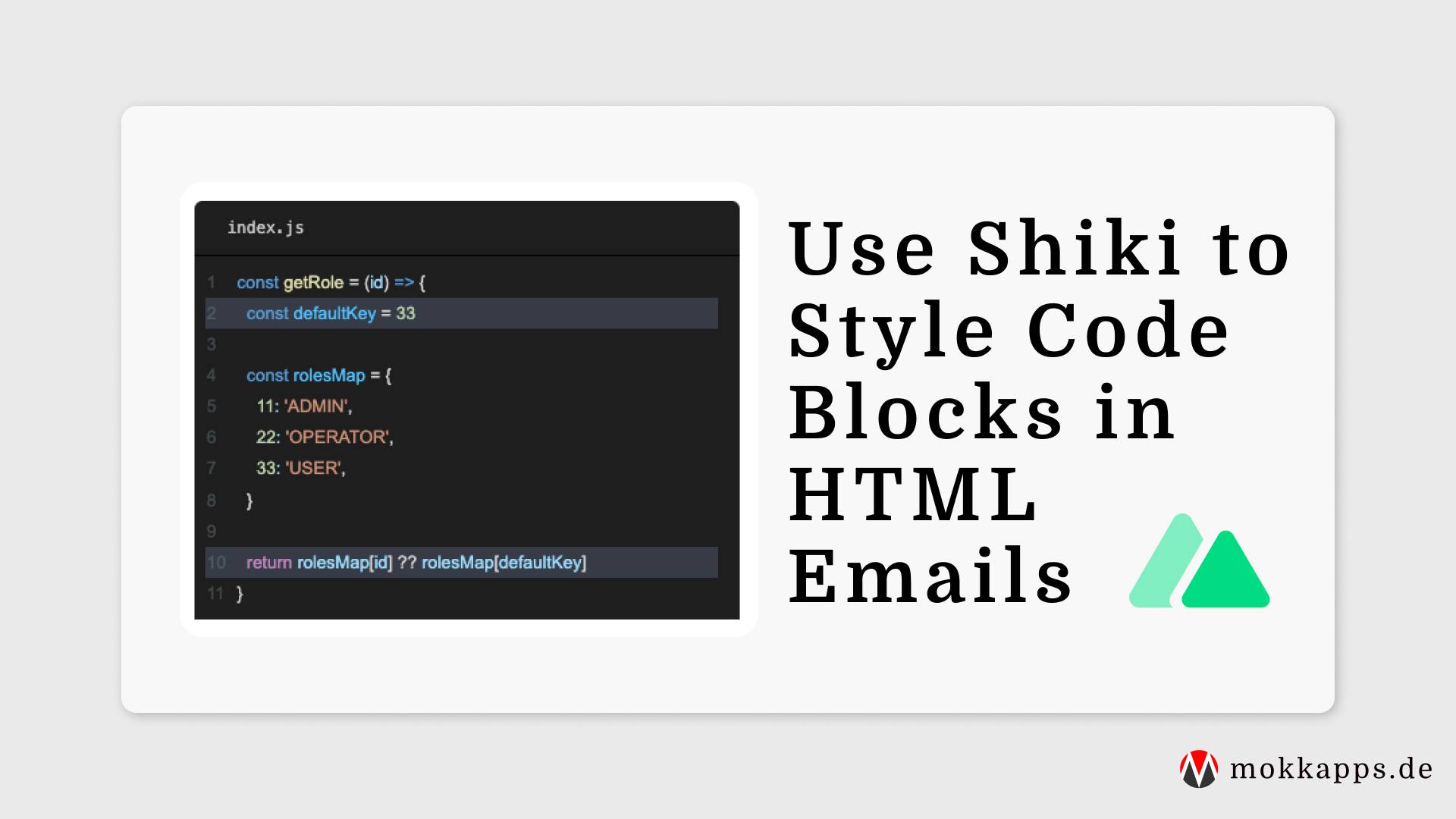
Use Shiki to Style Code Blocks in HTML Emails
Michael Hoffmann
@mokkapps
I recently developed a custom newsletter service using Nuxt 3. One of the main reasons why I developed it on my own was that I wanted to use good-looking code blocks in my emails.
In this article, I'll explain how I use Shiki to generate nicely styled code blocks in my newsletter emails.
Nuxt 3 & Nuxt Content
If you don't use Nuxt and are only interested in the necessary Shiki customization, you can skip the next sections, and head over to "Shiki Code" section.
On my newsletter website I use Nuxt 3 with the Nuxt Content and Nuxt Tailwind modules.
Nuxt Content uses Shiki that colors tokens with VSCode themes.
By default, it uses code, pre, span and div tags with CSS Flexbox to render the code block.
Unfortunately, flex-direction:column is badly supported in email clients.
Instead, we need to write the code block in an HTML table which is supported in all email clients.
So we need to eject from the default styling and create a custom code component.
Custom Prose Component
Nuxt Content uses Prose components to render markdown files in the DOM.
To overwrite a prose component, we can create a component with the same name in our project components/content/ directory.
In our case, we want to create a custom ProseCode component:
components/content/ProseCode.vue
<script setup lang="ts">
const props = withDefaults(
  defineProps<{ code?: string; language?: string | null; filename?: string | null; highlights?: Array<number> }>(),
  { code: '', language: null, filename: null, highlights: [] }
)
</script>

<template>
  <div></slot></div>
</template>
Next, we need to install shiki-es, a standalone build of Shiki fully compatible with all ESM environments:
# npm
npm i shiki-es

# yarn
yarn add shiki-es
We can eject from the default styling by removing the <slot/> tag and adding an html reactive variable that will contain the highlighted which is rendered via the v-html directive:
components/content/ProseCode.vue
<script setup lang="ts">
const props = withDefaults(
  defineProps<{ code?: string; language?: string | null; filename?: string | null; highlights?: Array<number> }>(),
  { code: '', language: null, filename: null, highlights: [] }
)

const html = ref('')
</script>

<template>
  <div class="code" v-html="html"></div>
</template>
Shiki Code
Now it's time to manually call Shiki to render our code as an HTML table. We, therefore, use shiki-es, a standalone build of Shiki that is fully compatible with all ESM environments.
Three steps are necessary to generate the HTML code:
- Use
getHighlighterto get an instance of the Shiki highlighter. - Call
codeToThemeTokenswith the given code and language to get the tokens that should be rendered. - Use
renderToHtmlto generate the HTML which should be rendered in the DOM. Itselementsobject can be used to modify the DOM structure of the code block. Here we add our<table>,<td>and<tr>tags which are necessary for the HTML table.
Let's take a look at the code:
components/content/ProseCode.vue
<script setup lang="ts">
import { getHighlighter, Highlighter, renderToHtml } from 'shiki-es'

const props = withDefaults(
  defineProps<{ code?: string; language?: string | null; filename?: string | null; highlights?: Array<number> }>(),
  { code: '', language: null, filename: null, highlights: [] }
)

const html = ref('')
const moreThanOneLineCode = computed(() => (props.code ? props.code.trim().split('\n').length > 1 : false))

const highlighter = await getHighlighter({
  theme: 'dark-plus',
  themes: ['dark-plus'],
  langs: ['java', 'javascript', 'html', 'css', 'typescript', 'json', 'scss', 'vue'],
})

const tokens = highlighter.codeToThemedTokens(props.code.trim(), props.language ?? undefined)

html.value = renderToHtml(tokens, {
  fg: highlighter.getForegroundColor('dark-plus'),
  bg: highlighter.getBackgroundColor('dark-plus'),
  // custom element renderer
  elements: {
    pre({ className, style, children }: any) {
      return `<pre tabindex="1" class="${className}" style="${style}">${children}</pre>`
    },
    code({ children, className, style }) {
      return `<code class="${className}" style="${style}"><table>${children}</table></code>`
    },
    line({ className, index, children }: any) {
      const shallHighlight = props.highlights?.includes(index + 1) ?? false
      const lineNumber = moreThanOneLineCode.value ? `<td><span class="line-number">${index + 1}</span></td>` : ''

      return `<tr class="${className} ${shallHighlight ? 'highlighted-line' : ''}">
    ${lineNumber}
    <td>${children}</td>
    </tr>`
    },
  },
})
</script>

<template>
  <div class="code" v-html="html"></div>
</template>
This code will result in this DOM structure:

CSS Styles
As mentioned, I use Tailwind in my project which heavily uses rgb colors. Unfortunately, rgb() works partially in email clients but alpha values and whitespace syntax are not supported.
I use the postcss-preset-env PostCSS plugin to convert modern CSS into something most browsers can understand:
nuxt.config.ts
export default defineNuxtConfig({
  // ...
  postcss: {
    plugins: {
      'postcss-preset-env': {},
      tailwindcss: {},
      autoprefixer: {},
    },
  },
})
Final Result
For example, this is how a code block in a newsletter email from Weekly Vue News looks like in a Gmail web client:

Conclusion
Styling HTML emails is a real pain but having good-looking code blocks in my newsletter emails was worth the effort. It's very sad that we still need to use HTML tables in HTML emails in the year 2023...
Thankfully, Nuxt Content is very customizable and allows developers to build custom solutions.
If you liked this article, follow me on Twitter to get notified about new blog posts and more content from me.
Alternatively (or additionally), you can subscribe to my weekly Vue newsletter.

