Blog
·
6 min read
·81 views
The Engineering Behind My Portfolio Website
Michael Hoffmann
@mokkapps

I created my first personal website in 2017 when I launched my first smartphone game. I use Google Analytics in this game, and it is, therefore necessary to provide a link to a privacy policy website from inside the game. I used WordPress and a free theme as I had nearly no frontend knowledge at that time:
 See the first version in the web archive
End of 2017 I then released a new version based on the open-source static site generator Hugo using the HTML5 Up Prologue theme. The idea was to have a unique design and better control over the layout:
 See the second version in the web archive
As I specialized more as a frontend developer I wanted to create my own portfolio website with its own styling. The inspiration came from Ali Spittel's blog post "Building a Kickass Portfolio".
Some of the main reasons which encouraged me to do the refactoring:
- Show my creativity and make a website that is a true expression of myself
- Design as much as possible myself without using pre-designed templates
- Make the site as fast and accessible as possible
- Provide a foundation to make the website easily extendable and adjustable
- Make the website fully responsive
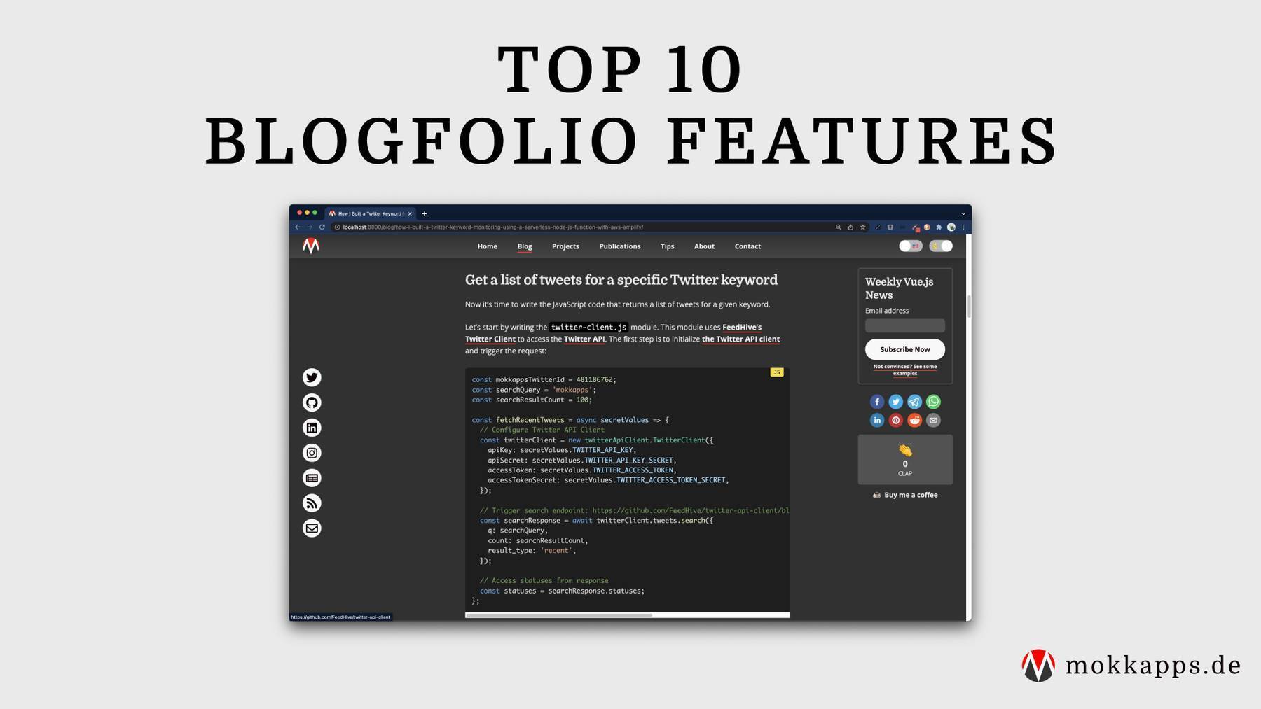
The result can be seen at www.mokkapps.de:

The basic implementation took about 40 hours of work. I did not draft my sites before moving to code but just started coding and experimented with different designs.
Website Generator
I decided to use Gatsby.js due to several reasons:
- I love using React and its rich ecosystem of libraries, components, etc.
- It uses GraphQL, which I wanted to gain some more practical experience with.
- Very good documentation, plugins & starters.
- Can be easily combined with several APIs, CMS, and more.
The following graphic from the official website showcases how Gatsby works:

As a starter, I used the fantastic Gatsby Starter Kit, which provided an ideal bare-bone application for my website.
Hosting
I use Netlify to host my website, an all-in-one platform for automating modern web projects.
It can be used for free if you have a public GitHub project. I decided to provide my website code open-source on GitHub as I wanted to demonstrate my skills to everybody interested in it.
Styled Components
I like the idea of Styled Components and how it nicely integrates into a React component.
Styled Components utilizes tagged template literals to style your components. It removes the mapping between components and styles. This means that when you're defining your styles, you're actually creating a normal React component that has your styles attached to it.
Take a look at the following component of my website:
import React from 'react'
import PropTypes from 'prop-types'
import styled from 'styled-components'

const StyledArticle = styled.article`
  max-width: 600px;
  margin: 0 auto 30px;

  background: white;
  border-radius: 10px;
  padding: 2rem;
  min-width: ${(props) => (props.narrow ? '50%' : '100%')};
`

const Article = ({ children }) => <StyledArticle>{children}</StyledArticle>

Article.propTypes = {
  children: PropTypes.node.isRequired,
}

export default Article
In this example I use the <article> HTML tag but use it as StyledArticle which attaches my CSS styles. It is even possible to apply styles based on props which are passed to the component as you can see in this line:
min-width: ${props => (props.narrow ? '50%' : '100%')};
Responsive Images
Delivering images in the optimal size for the correct devices is crucial for a good website. It ensures that your site loads quickly and does not slow down when you use many pictures on the website.
The "gatsby-image" plugin is a fantastic solution for this requirement. It automatically resizes your images so your site won't load huge images on a mobile device. Additionally, it lazy loads the images and provides a nice blur effect while the images are loaded:

Typography
I wanted a typography design and used Typography.js, which is also recommended by the Gatsby documentation.
My configuration file looks this way:
import Typography from 'typography'
import CodePlugin from 'typography-plugin-code'
import theme from 'typography-theme-alton'

theme.overrideThemeStyles = ({ rhythm }, options) => ({
  a: {
    color: '#FC1A20',
    textDecoration: 'none',
  },

  'a:hover': {
    color: '#FC1A20',
    textDecoration: 'underline',
  },

  html: {
    boxSizing: 'border-box',
    background: '#424242',
  },
})

theme.plugins = [new CodePlugin()]

const typography = new Typography(theme)

export default typography
In the next image, you can see the difference between my landing page with (upper image) and without (lower image) Typography.js:

Blog
I enjoy writing articles in Markdown and wanted to use Markdown files as a source for my blog.
The Gatsby Starter Kit already includes some excellent features for this requirement:
- Posts pages are automatically created from markdown files
- Categories are automatically created for blog posts
- Web pages are automatically created from markdown pages files
The relevant folder structure in the code looks this way:
root
  └── src
      ├── content
      │   ├── posts
      │   │   ├── 2018-05-11___my-first-vs-code-extension
      │   │   |   ├── jasmine-test-selector.png
      │   │   │   └── index.md
      │   │   ├── 2018-05-12___my-first-npm-package
      │   │   |   ├── github-traffic-cli.png
      │   │   │   └── index.md
      |   |
      |   |   ...
Using my Gatsby configuration, it automatically creates a blog post page for each of the folders, e.g
https://www.mokkapps.de/blog/my-first-vs-code-extension/
Continuous Integration
I use Travis CI to deploy & test my website each time I push to my git master branch.
Here is an excerpt of my .travis.yml file:
script:
  - npm run lint
  - npm run test:e2e:ci
  - npm run build

deploy:
  provider: script
  script: "curl -X POST -d '' https://api.netlify.com/build_hooks/5ba3c8da1f12b70cbbcaa1a3"
  skip_cleanup: true
  on:
    branch: master
So on each push to master, it runs the TS linter, E2E test and builds the application. If all scripts succeed, a deployment on Netlify is triggered via webhook.
I therefore disabled auto-publishing in Netlify, which usually triggers a deployment each time a git push was detected on the configured branch.
In my case, I want to trigger a deployment if the tests and the build were successful.

Netlify also automatically builds a preview with a unique URL. Previews are perfect for testing and collaboration as a staging environment for every PR or branch. So I can even preview my new build before I manually deploy it.
E2E Tests
For my E2E tests, I use Cypress.io as I heard a lot of good stuff about it.
I created a set of tests that test the most critical function of my application.
For example, the E2E test of my home page:
import config from '../../src/content/meta/config'

describe('Home Page Test', () => {
  beforeEach(() => {
    cy.visit('/')
  })

  it('includes a heading and a quote', () => {
    cy.get('[data-cy=hero-heading]')
    cy.get('[data-cy=hero-quote]')
  })

  it('shows characteristics section', () => {
    cy.get('[data-cy=hero-characteristics-section]').children().should('have.length', 4)

    cy.get('[data-cy=hero-characteristics-more-button]').click()
    cy.url().should('include', '/about')
  })

  it('shows featured projects', () => {
    const countFeaturedProjects = config.projects.filter((p) => p.featured)
    cy.get('[data-cy=hero-projects-section]').children().should('have.length', countFeaturedProjects.length)

    cy.get('[data-cy=hero-projects-more-button]').click()
    cy.url().should('include', '/projects')
  })

  it('shows latest blog post', () => {
    cy.get('[data-cy=blog-post-0]')
    cy.get('[data-cy=hero-blog-more-button]').click()
    cy.url().should('include', '/blog')
  })
})
This video shows a Cypress test run on my website:

Lighthouse
For me, it was important to have a good Google Lighthouse score, and with Gatsby.js you achieve great results nearly out of the box:

Sentry
To track errors on my website, I use Sentry, an open-source error tracking software. It can be easily integrated into Gatsby using gatsby-plugin-sentry.
Conclusion
I am proud of my website, and I enjoyed engineering it. This website represents me on the world wide web, and I am very interested in its design, quality, accessibility, and page views.
I use it for marketing myself in different aspects:
- Show specific skills to employers
- Tell people to read my blog
- Promote my private projects
In my opinion, each web developer should have a custom website. A portfolio website is a true expression of yourself. We are programmers, and it is a creative process, so use and demonstrate your creativity.


